
This is the first part of a series of 3 posts in which I’ll try to articulate my thoughts about Black and White and Fine Art Photography. In this first post I’ll provide some context on the topic, in the second part I’ll explain my point of view on why, particularly in fine art photography, it is critical to have a vision for your images and ideally be able to articulate that vision. Finally, in the third post I’ll cover the crafting of black and white images from a more technical perspective including both in-camera aspects and recommendations as well as an overview of post-processing techniques and tools that you can use.
According to Wikipedia “fine art photography is created in accordance with the vision of the artist as photographer. Fine art photography stands in contrast to representational photography, such as photojournalism, which provides a documentary visual account of specific subjects and events, …”
Let’s start analyzing the first sentence of this definition which states that fine art photography is created in accordance to the vision of the artist. So, this implies with no ambiguities that to create a fine art photograph you must have a vision, a representation in your mind of how you want the image that you’re capturing to be perceived by your viewers, what feelings you want to convey, what reaction either positive or negative you want to provoke. We’ll be back to this topic in the second part of this series for now let’s focus on the selection of black and white over color.
Of course the selection of black and white over color in a photograph is a photographer’s choice, however that decision will determine among other things your potential audience, most likely will also determine how your work will be classified by art curators and other stakeholders of your work such as gallery owners, and ultimately will influence the appealing of your work either as a piece of art or as a commercial image.
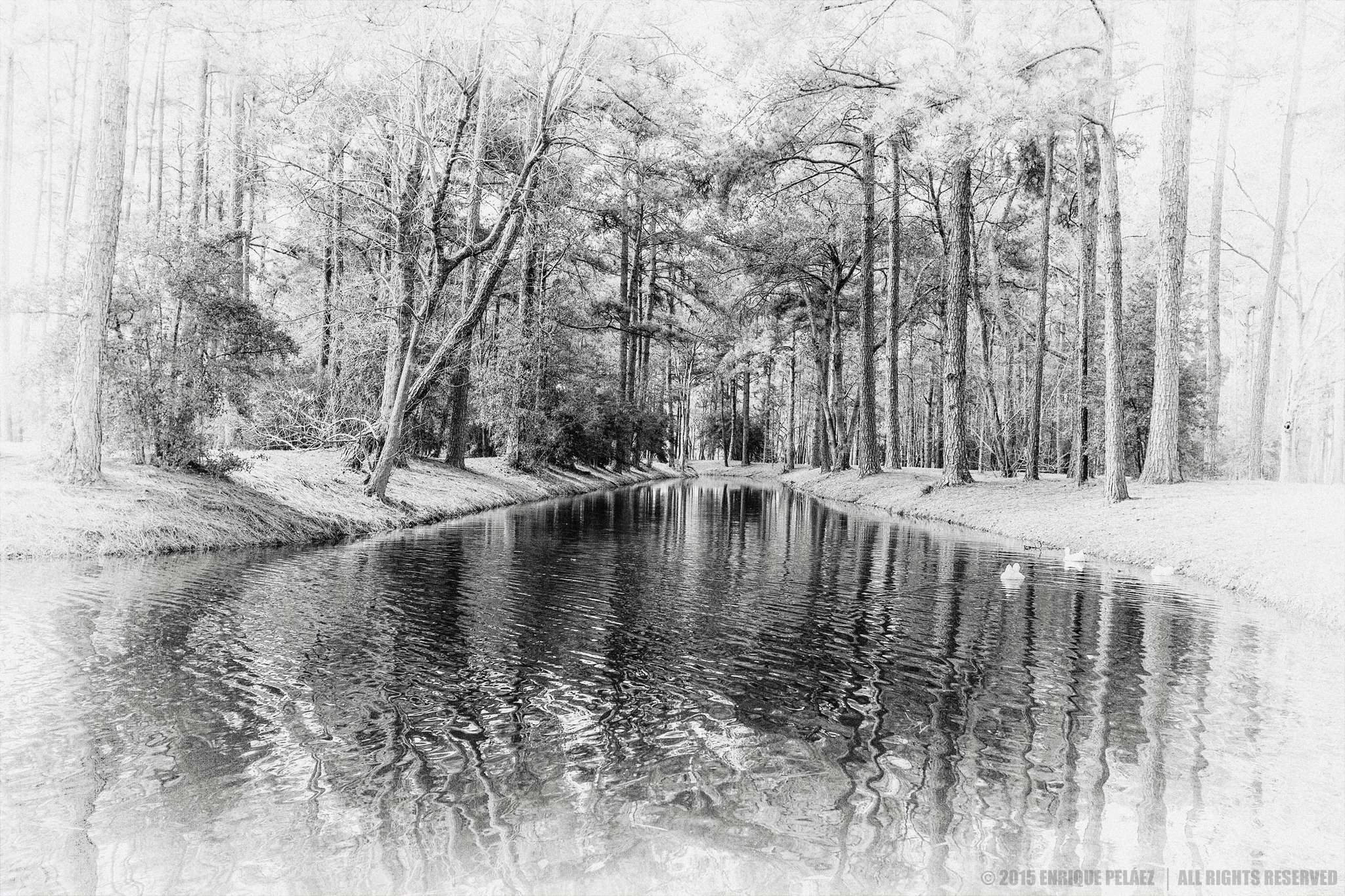
If you’re an aspiring to fine art photographer or you’re a fine art photographer you probably be familiar with the fact the most fine art photographers prefer monochrome over color images. So, the question is why? What is in black-and-white that makes it so attractive to fine art photographers? If you ask this question to 10 different fine art photographers my guess is that you will get 10 different responses, going from topics like “color is a distraction”, “to favor composition over color in the image”, “because it’s so classic” or simply because besides of being classic black-and-white is trendy. Yes, black-and-white seems to be taking over the photography scene not just in fine arts but as a general retro-trend in photography, just take a look to the most popular photo magazines such as Digital PhotoPro and you’ll find not just retro-look gear, but also plenty of black-and-white photography.
Now, to add to the different photographers responses to the question let me try to articulate why I prefer black-and-white over color in my work. I’ll start by paraphrasing Patrick Summerfield who said “Black and White photography is a perfect lie”. Yes, I agree with Summerfield in the sense that black-and-white can radically change the way we perceive “reality”, unless you’re color-blind color is the “normal” way to perceive the world, so from that perspective when we convert a digital image to monochrome tones we’re basically re-interpreting “reality” in our particular vision which is at the end of day what fine art photographers are supposed to do, right? Now, please don’t get me wrong I have the utmost respect for fine art photographers that use color, and I admire the work of some of them, however in my personal view of the world black-and-white has a particular, almost insane attraction that I can’t help.
 From a technical perspective the beauty of black-and-white is that photographers can control how colors will render into different tones of gray. In the film days photographers used color filters (in-camera) to alter how colors were seen by the lens, so this way they affected the gray tones that were actually recorded on the film. In the digital photography days you usually apply those filters in post-production giving the photographer the flexibility to play not just with color filters, but also with the sensitivity of the digitally emulated “film” to the light (see Nik’s Silver Effex Pro 2 user interface). This flexibility allows a countless number of possibilities to create a rich gamma of monochromes tones which along with composition are the basic elements you have to create fine art black and white images. I’ll expand on this and other technical topics in the third post of this series.
I hope what you have read so far is interesting enough for you in order to come back in a week and read the second part of this post. For now I just like to remind you that if you want to receive direct notifications when I publish new posts in my blog you can subscribe to my blog.
Have a fantastic day and thanks for reading my blog notes.
Website – http://www.enrique-pelaez.com/
Facebook Page – https://www.facebook.com/EnriquePelaezPhotography
Google Plus – https://plus.google.com/u/0/+EnriquePelaez
