To consult the rules of composition before making a picture is a little like consulting the law of gravitation before going for a walk.”
― Edward Weston
This is the third publication of a series in which I’m addressing the topic of black-and-white, in the two first posts I provided an overview of what black-and-photography is about, in this one I’ll start a discussion on visualizing black-and-white images.
This series will include posts and videos that can be easily located by using the tag “learning-black-and-white” either in the search box above, or by directly clicking on the tag name at the bottom of this post.
So, let’s get started. Creating successful black-and-white images is a twofold process. First of all, you have to learn to capture images that will work in this medium — in other words you have to learn to “seeing in black-and-white” — and secondly, post-processing is just as important as clicking images that are suitable for a black-and-white conversion. In this post I’ll discuss the elements that make an image a good candidate to be converted to black-and-white, and in subsequent posts I’ll start discussing black-and-white post-processing techniques.
I’ll go through the different elements to look for when clicking black-and-white images, however before doing so, I’d like to spend some time talking about the role of color in an image.
Generally speaking in a successful monochrome image color may not add anything, moreover it turns into a distraction, a liability. However, we need to recognize that there are images that simply look better in color, the question is why? So, before converting an image to black-and-white, we need to figure out the contribution of color to that particular image, is color conveying a particular story, feeling or mood? is color playing a major role into the composition of the image?
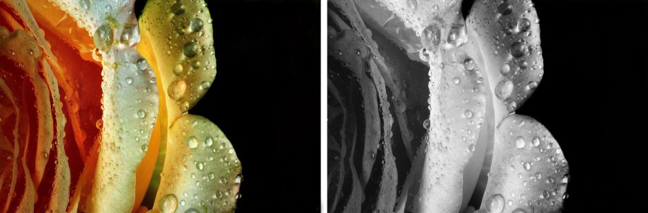
In figure 1 for example, the nice color gradient, going from orange to yellow tones, provides visual separation, moreover it provides context in order to figure out that this is a close-up view of a rose, in other words color plays an important role into the composition of the image. In the black-and-white version the shapes provide some context, but it turns more into an abstract image without really having the visual impact that a good abstract generally has.
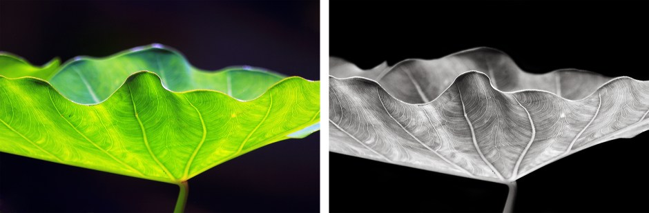
Now, let’s take a look to figure 2, the intense color green intensified by the effect of the natural light is just a distraction, pulling the attention away from the magnificent texture, patterns, and details on the leaf that can be nicely appreciated in the black-and-white version.
In general, it’s very important to analyze the role that color is playing, just in that way you will be able to really start seeing images in black-and-white. So, understanding the role of color will make you more successful on shooting images that will work in black-and-white. Having said that, certainly there are attributes that generally speaking can break or make a black-and-white image, so let’s take a look to those attributes.
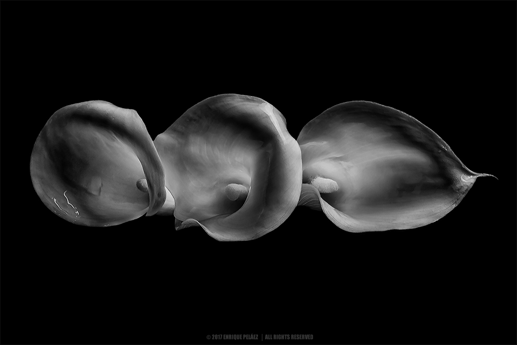
The first attribute to look for are shapes — usually basic shapes such as triangles and rectangles are more effective, however more sophisticated shapes can also work. The right use of shapes in the composition will lead to a more organized, structured distribution of the image elements. For example, in figure 3, the three obvious triangles formed by the alternated sequence of bright, dark, bright sections having all three a common vertex right on the top a little off center, led to an organized yet dynamic composition. Now, the question is, do you think color would make this image any better? in my opinion, it probably not.
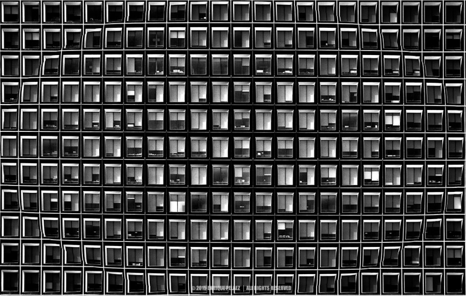
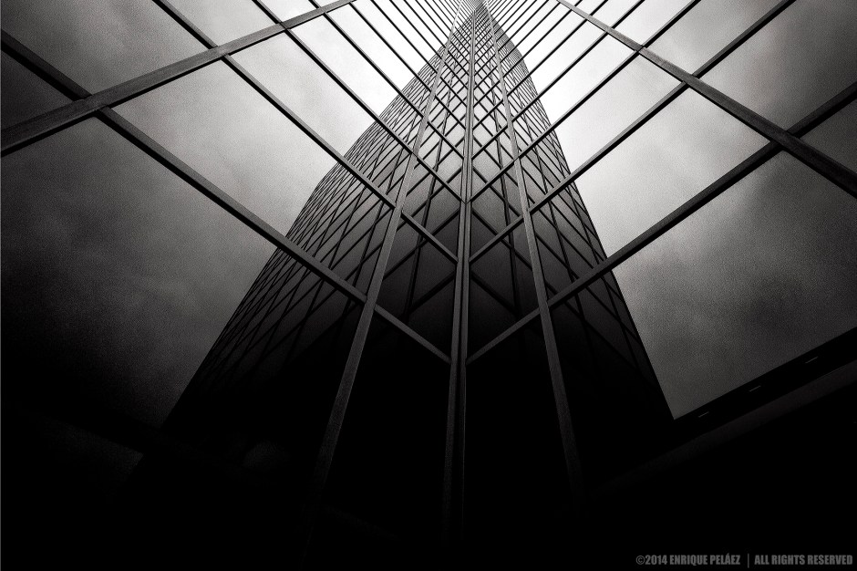
One second attribute that I generally look for in black-and-white images are patterns, both natural patterns and man-made, they both bring harmony to the image composition, and if properly used, they usually make color irrelevant to the composition. In figure 4 for example the isolation of the patterns — in this case the repetition of windows — creates a rhythm, a cadence creating a sense of intrigue, that I find so seductive in this particular image.
The third attribute that I generally look for in my monochrome image are textures. Not all textures look good in black-and-white, in my book, the key is to figure out how the lack of color emphasizes the texture — there are some textures in which color plays an important role, same aspects related to the role of color in images discussed at the beginning of this post must be considered for textures as well — and especially how the texture may change the visual impact of the black-and-white image.
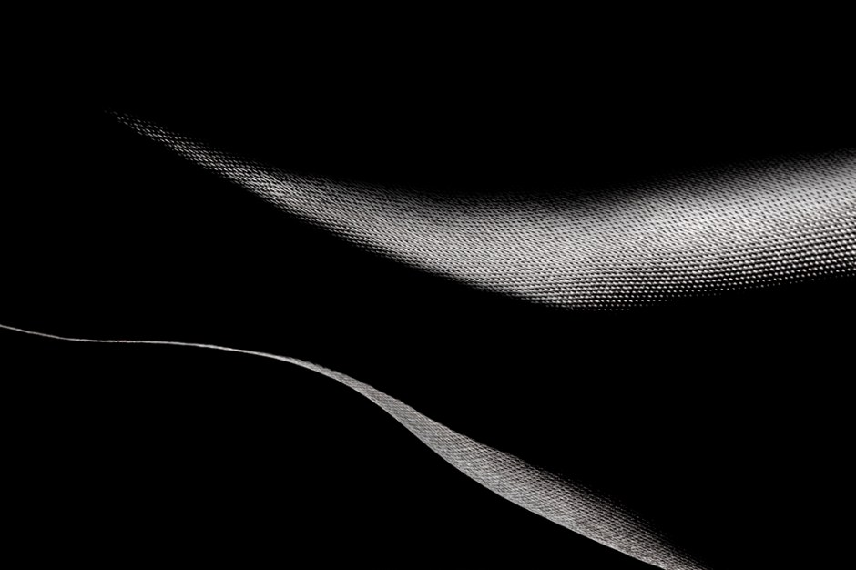
One of the best ways to appreciate textures is through macro photography. Let’s take a look to figure 5, can you figure out what that is? well, its is a macro view of a ribbon and its reflection on a piece or black acrylic. So, what really makes this image especial is the appreciation of the beautiful texture on the ribbon that along with shapes and tonal range contribute to create a sort of rarefied, sensual mood that’s the essence of the image.
Naturally contrasting images is also an attribute that I generally look for when clicking black-and-white images, however contrast is one of the focal point enhancers that work best in monochrome images in order to emphasize subjects in post-processing, so we’ll extensively discuss contrast in subsequent posts.
In the next post I’ll start discussing some in-camera techniques to help you capture better black-and-white images and after that, I’ll start discussing post-processing techniques. So, keep in touch.
I do appreciate your comments and suggestions. If you are interested in more information regarding the making of my images, as well as general information about black-and-white photography, please subscribe to my blog to receive automatic notifications every time I publish a new post.
Website – http://www.enrique-pelaez.com/
Instagram Page – https://www.instagram.com/enrique.pelaez.houston/?hl=en
Facebook Page – https://www.facebook.com/EnriquePelaezPhotography
Google Plus – https://plus.google.com/u/0/+EnriquePelaez
