Vision
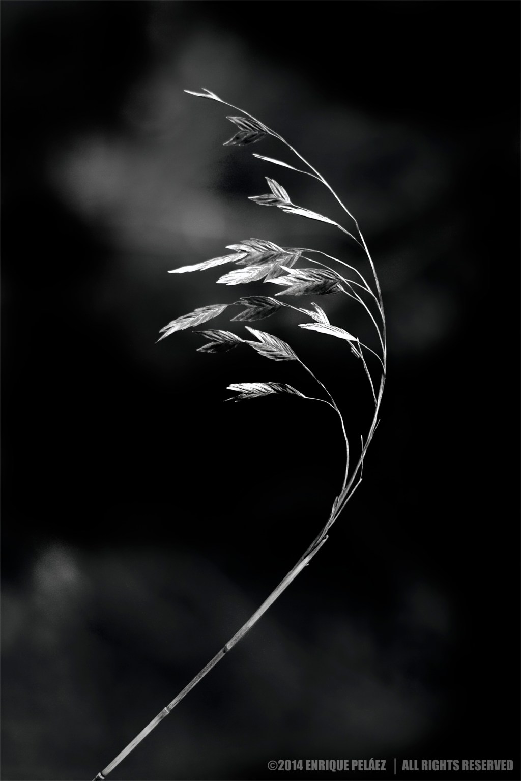
The goal was to create a surreal image based in photographic elements — please note that this is not a composite but a photo that has being treated using traditional tools like burn and dodge to create this surreal effect.
According to Wikipedia Surrealism is a cultural movement that began in the early 1920s, and is best known for its visual artworks and writings. The aim was to “resolve the previously contradictory conditions of dream and reality.” Artists painted unnerving, illogical scenes with photographic precision, created strange creatures from everyday objects and developed painting techniques that allowed the unconscious to express itself and/or an idea/concept.
So, in my opinion in this photo there are some elements that makes it seem illogical like the size relationship between the plant and the supposedly clouds in the background as well as the position of the leaves apparently being hitten by the wind. I´ll explain how these effects were achieved in the next section.
Craft
First of all this image was originally clicked in a horizontal format not a vertical format, I rotated it in post production, so that explains that the position of the plant is not produced by the wind hitting it but it’s simply the gravity effect.
Now, I clicked this image at f/1.2 with a 50mm f/1.2 USM Canon lens so the bokeh in the background (some bushes) was soft and blurred enough that after making the black and white conversion using a green filter the bushes rendered mostly white resembling some clouds that using the PS CC burn tool I altered to make the surreal effect more evident.
In-Camera Details
First some personal thoughts on histograms. In very simple terms in statistics a histogram is a representation of the distribution of data. So a digital image histogram is not other thing but a representation of the distribution of pixels in the image according to the tone value of each individual pixel.
So the first important aspect to understand about a digital image histograms is what the horizontal and vertical axis actually measure. The horizontal axis is a representation of the different tone values in the image going from 0 (pure black) to 255 (pure white) and the vertical axis represent the number of pixels in the image that fall in each specific tone value.
Now usually the histograms that we see in the back of DSLRs and other cameras is a representation of a low resolution JPEG image that the camera process according to your camera settings for that particular image. So if you don’t shoot JPEG but RAW “What you see IS NOT what you get” but just an approximation of what your final image histogram will look like moreover if you shoot RAW there is some exposure (and other EXIF image attributes) latitude that can be used to significantly alter the distribution of the histogram in post-production.
In terms of exposure strategy I regularly use both ETTR and “expose for the shadows” depending on the light condition of the particular image. For example for sunrises and other high contrasting images I usually use a “expose for the shadows” approach given the high risk of over-blowing the highlights however in normal light conditions I try first to expose to the the right (to obtain a better image quality) and if this doesn’t work (not enough details in the shadows) I usually shift to the “expose for the shadows” approach.
In this particular I use a “expose for the shadows” approach which I think worked very well in terms of retaining details in both the shadows and the highlights and allowed me to take advantage of the vivid green tones in the background (bokeh) to render those with a cloud-alike look during the black and white conversion.
Post-Processing Details
In terms of processing I didn’t do much different to I generally do: Adobe Camera Raw to make general adjustment to the raw file, then I processed the image with Nik’s Color Effects to create color tonal separation and then I used Nik’s Silver effect to convert to black and white.
A variant to my normal workflow was the use of Nik’s Viveza that I basically used to enhanced the bokeh in the background, a technique that I used to give the background this cloud alike look is protect the image subject (in the case the plant) with a control point then add another control point that I usually place in some place in the middle of the image to try to cover as much space as possible and then then set to -100% the Structure Slider, if I’m not satisfied with the result I repeat the process as many times as needed until I get the look I want, in this case given the bokeh was already very blurred and soft (f/1.4) I did the process just once. As mentioned above I used the burn tool to completely dark parts of the background and create that sense of clouds floating around the plant.
I do appreciate your time to read this post, if you are interested in more information regarding the making on my images please subscribe to my blog to receive automatic notifications when I publish a new one.
Website – http://www.enrique-pelaez.com/
Facebook Page – https://www.facebook.com/EnriquePelaezPhotography
Google Plus – https://plus.google.com/u/0/+EnriquePelaez
