This is the seventh post of a series of publications in which — from different angles and perspectives — I’m addressing the topic of composition.
This series includes posts and videos that can be located by using the tag “learning-composition” either in the search box above or by directly clicking on the tag name at the bottom of this post. Also, here is a link to the entire series so far.
In the previous posts of this series we explored the topic of how to efficiently use shapes and tools to enhance your composition approach, also we discussed how certain composition approaches and/or composition rules — such as the golden rule, the rule of thirds, triangle-based composition, etc. — can help you to better convey your artistic vision.
In this topic, we’ll discuss a technique known as “negative space” that is usually used to reinforce your composition approach by creating contrast between the main subject and those elements whose function is to support the main subject.
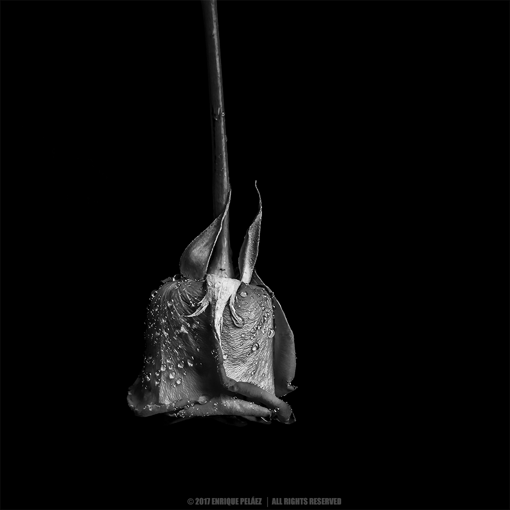
In simple words, negative space is a technique that uses low impact elements in order to help the main subject to stand out and capture the viewer’s attention. Now, these low impact elements can obviously be a flat color, either a very dark or very bright tone surrounding the main subject, however, there are also other low impact elements such as areas of low contrast, subtle textures or gradients, blurred areas, etc. that can be part of the negative space as well.
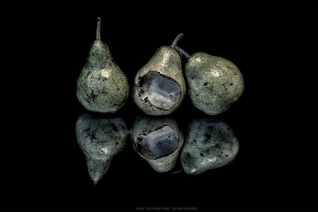
Let’s analyze some examples. Figure 1 shows an still life which is an obvious example of negative space. The black tone surrounding the subject is the low impact element that stands out the main subject — the three pears.

Now, let’s take a look to the image in figure 2. The blurred background and foreground in the image — produced by the shallow depth of field (f/7.1 @300mm) used to capture the image — act as negative space directing the viewer’s attention to the child, but at the same time providing enough context information in order to figure out the subject surroundings.
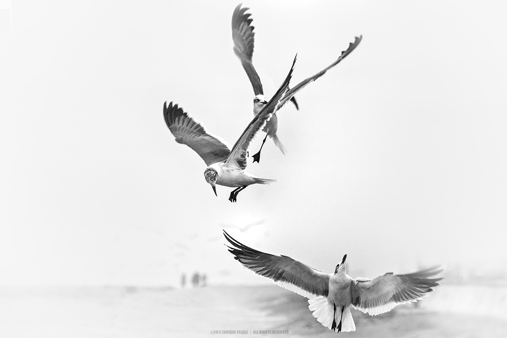
Figure 3 shows an image in which the negative space is an almost white area with the exception of some areas in the background that again, allow the viewer to get a sense of what the subject surroundings are about without distracting from the main subject.
I do appreciate your comments and suggestions. If you are interested in more information regarding the making of my images, as well as general information about fine art photography, please subscribe to my blog to receive automatic notifications every time I publish a new post.
Website – http://www.enrique-pelaez.com/
Instagram Page – https://www.instagram.com/enrique.pelaez.houston/?hl=en
Facebook Page – https://www.facebook.com/EnriquePelaezPhotography
Google Plus – https://plus.google.com/u/0/+EnriquePelaez
